Lethor: A Display Font That Commands Attention—Without Shouting
It was 3 p.m. on a Tuesday—two days before the launch of our client’s new online course series—and I was tweaking the final Instagram carousel. The headline needed to land instantly in a feed full of motion, color, and competing text. I swapped in Lethor. Suddenly, the top slide didn’t just say “Unlock Your Creative Flow”—it held space. Not with size or brightness, but with presence. That’s when it clicked: Lethor isn’t just another display font. It’s a visual pause button.
What Lethor Actually Feels Like in Motion
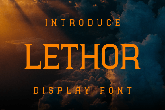
Lethor is a meticulously crafted display font with strong, confident letterforms and subtle organic detailing—think clean geometry softened by intentional curves and balanced negative space. It’s not ornate, but it’s never flat. There’s a quiet confidence in its rhythm: uppercase letters sit tall and grounded; lowercase characters carry just enough personality to feel human, not robotic. It reads as modern but not cold, bold but not aggressive. In practice, that means it communicates authority without stiffness—and approachability without dilution.
We used it across three core campaign touchpoints: YouTube thumbnails (1280×720), Instagram Reels covers (1080×1350), and email banner headers (600px wide). In every case, Lethor held up under compression, scaling, and fast-scrolling conditions. On mobile previews, its generous x-height and open counters kept legibility intact—even at 48px on thumbnail overlays over busy background imagery.
Where It Shines (and Where It Steps Back)
Lethor excels where impact matters more than volume: short headlines, campaign labels (“Early Access,” “New Season,” “Limited Drop”), quote graphics, webinar banners, and branded template titles. We paired it with a neutral sans serif (Inter, regular weight) for body copy—and the contrast worked beautifully. Lethor anchored the message; Inter carried the details. No competition. Just clarity.
It’s not built for paragraphs. Don’t use it for email body text, product descriptions, or multi-line captions in Pinterest pins. Its character density and deliberate spacing make it less forgiving at small sizes or in tight containers. And while it works on both light and dark backgrounds, avoid ultra-thin white text on busy photo overlays—its detail gets lost. For those cases, we dropped to 32px minimum and added a subtle drop shadow (2px blur, 1px offset) for separation.
We tested it in a digital ad set targeting creators: one variation used Lethor for the headline only (“Your First 10K Followers Start Here”), another used it for both headline and subhead. Engagement metrics didn’t shift dramatically—but qualitative feedback from our internal review panel was consistent: “The first version felt intentional. The second felt crowded.” Lethor earns attention best when given room to breathe.
Real Campaign Uses—No Guesswork
- Instagram Content Series: Used Lethor for episode titles (“Week 1: Foundations,” “Week 2: Voice”) across static posts and Stories stickers. Its consistency helped viewers recognize the series at a glance—even without logos.
- YouTuber Thumbnail Set: Applied to bold, centered phrases like “NO TOOLS NEEDED” and “FREE TEMPLATE INSIDE.” Paired with high-contrast color blocking, it cut through algorithmic noise without needing extra animation.
- Online Shop Campaign: Featured on limited-edition product teaser banners (“Coming Soon: Studio Edit Kit”). Its refined yet energetic tone aligned with the brand’s creative-but-polished identity—more “curated toolkit” than “flash sale.”
- Email Promo Banner: Used at 60px on a 600px-wide header above a CTA button. Rendered cleanly across Gmail, Apple Mail, and Outlook—no fallback needed, thanks to solid webfont support and included WOFF2 files.
Smart Pairing & Practical Checks Before You Drop It In
Lethor pairs naturally with clean, humanist sans serifs (like Inter, Poppins, or Manrope) for balance and readability. With serif fonts, go minimal—try Lora or Literata in regular weight, but only for short supporting lines. Avoid pairing it with other display or script fonts unless you’re designing a logo lockup or editorial masthead where hierarchy is tightly controlled.
Before using Lethor in client work or digital products, check what’s included: at minimum, you’ll want Regular and Bold weights, basic Latin character sets, and OpenType features like standard ligatures and stylistic alternates (we used the alternate ‘g’ and ‘a’ in a few quote graphics—it added subtle distinction without distraction). Confirm commercial licensing covers your use case—especially if you’re embedding it in templates sold on marketplaces or using it in merch mockups. Most reputable sellers include clear usage terms, but always verify.
We also tested multilingual support briefly—Lethor covered English, Spanish, French, and German well. For broader European language needs, double-check accented characters and diacritics in your design tool before finalizing layouts.
A Font That Serves the Message—Not the Other Way Around
Lethor doesn’t try to be everything. It’s not a system font. It’s not meant for interfaces or data tables. But when your goal is to make someone stop mid-scroll, recognize your voice in three words, or feel the tone of a campaign before reading a single sentence—that’s where Lethor delivers. It’s the kind of display font that makes typography feel like strategy, not decoration.
In a world where visual fatigue is real and attention is fragmented, choosing a font like Lethor isn’t about trend-chasing. It’s about selecting a tool that aligns with how people actually see, scan, and remember. It’s precise. It’s intentional. And once you’ve used it in a live campaign, you’ll notice how rarely you reach for something flashier—and how often you return to its quiet confidence.