Gronde: A Distinctive Display Font for Digital Branding
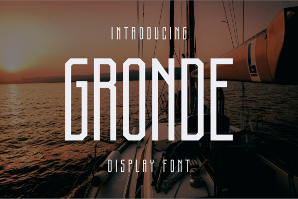
As a UI designer who ships dozens of landing pages, SaaS dashboards, and e-commerce experiences each year, I pay close attention to how typefaces shape perception before a single word is read. Gronde stands out—not because it shouts, but because it carries quiet confidence. It’s a display font with deliberate craftsmanship: clean lines, balanced proportions, and subtle detailing that rewards closer inspection without sacrificing legibility at scale.
Gronde isn’t built for body text or interface labels. Its strength lies in commanding attention where it matters most—hero section headlines, product name treatments, CTA banners, and brand lockups. The letterforms have a grounded rhythm and consistent stroke contrast that reads well across devices. On mobile, it holds its presence at 48px and up; on desktop, it gains dimension at 72px+, especially against generous whitespace or soft gradient overlays.
Where Gronde Earns Its Place in Your Layouts
In practice, Gronde excels in high-impact, low-frequency roles. Think of it as your visual anchor—not the supporting cast, but the first impression that sets tone and intent.
- Landing pages: Use Gronde for the primary headline above the fold. Paired with a neutral sans serif like Inter or Manrope for subheadings and body copy, it creates immediate hierarchy and signals intentionality—ideal for coaching sites, course sales pages, or B2B tool launches.
- Online stores: Apply it selectively to collection banners (“Handcrafted Ceramics”), limited-edition drops, or boutique brand names. Avoid overuse—it’s most effective when contrasted with functional typography elsewhere.
- Portfolio & creative sites: Gronde reinforces authorship. On a designer’s personal site, it works beautifully in the masthead, project titles, and “About” section headers—communicating care and craft without leaning into clichéd script or retro tropes.
- Digital ads & social banners: Its clarity at medium sizes (36–60px) makes it reliable for static and motion graphics. Test it over muted backgrounds or subtle textures—it avoids visual noise while maintaining readability.
Readability & Responsiveness: Practical Considerations
Gronde performs best when given room to breathe. On light backgrounds, it’s crisp and authoritative. Over dark or image-based backgrounds, ensure sufficient contrast—aim for at least 4.5:1 against solid overlays or use a subtle text shadow for lift. Avoid using it below 32px on desktop or below 28px on mobile; smaller sizes dilute its structural nuance and reduce scan efficiency.
It’s not a variable font, so check what weights are included. Most web-ready versions ship with Regular and Bold—sufficient for layered heading systems (e.g., H1 = Gronde Bold, H2 = Gronde Regular). If your project needs fine-grained typographic control, verify whether stylistic alternates or small caps are available. Multilingual support varies by vendor—confirm Latin Extended-A coverage if you serve European or Canadian audiences.
Smart Pairing for Balanced Digital Typography
No display font lives in isolation—and Gronde thrives when paired intentionally. Its personality sits comfortably between modern and timeless, making it highly compatible with both humanist sans serifs and refined serifs.
- Sans serif pairings: Inter, Poppins, or IBM Plex Sans provide clean, accessible contrast for paragraphs, navigation, and form fields. Their open apertures and generous x-height keep interfaces scannable and inclusive.
- Serif pairings: For editorial or luxury contexts—think digital magazines, premium course platforms, or artisanal brands—try pairing Gronde with Lora or Crimson Text. The serif adds gravitas and narrative warmth without competing visually.
- Avoid: Overly decorative fonts, tight condensed sans serifs, or heavy scripts. Gronde’s clarity gets lost when surrounded by visual clutter or competing contrast.
Brand Tone, Trust, and Conversion Alignment
Typeface choice quietly influences perceived credibility. Gronde conveys competence and creativity—not flashy, not sterile. That balance supports trust-building on conversion-focused pages: users register professionalism before reading a single benefit bullet.
On a SaaS pricing page, for example, using Gronde for “Start Free Trial” (instead of a generic system font) subtly elevates the offer. It doesn’t increase friction—it adds weight. Similarly, in a wellness brand’s hero section, “Your Calm Starts Here” set in Gronde feels intentional and calm, not clinical or cold.
This isn’t about decoration. It’s about signaling alignment: between voice and visual, message and medium, brand promise and pixel-perfect delivery.
Licensing & Real-World Usage Notes
Gronde is a commercial font, and licensing matters—especially for client work, online stores, and digital templates. Always confirm the license covers web embedding (WOFF2/WOFF), number of domains or pageviews, and usage in downloadable assets like PDF pitch decks or branded Notion templates.
For freelance designers: include Gronde licensing in your scope-of-work documentation. For SaaS founders: verify that your subscription plan permits use across all marketing microsites and in-app branding elements. Most reputable vendors offer clear, tiered licenses—avoid free “download” sites that lack proper redistribution rights.
When implemented thoughtfully, Gronde does more than look good. It sharpens focus, strengthens identity, and supports user decisions—not by shouting, but by standing still with purpose. In an ecosystem saturated with interchangeable fonts, that kind of distinction is rare, valuable, and deeply practical.